


Repetition and alignment in Armin Hofmann's work
- Yuliya Pylypko

- Oct 3, 2020
- 1 min read
Updated: Mar 30, 2021
The invisible alignment and relationships between the elements create harmony. Arranged irregularities and the constant contrast between large and small make the work of Armin Hofmann so pleasing to look at. The dynamism of form doesn't mean it's complete randomness. Encounters between dissimilar elements within compositions lead the eye to follow the hidden grid. when the next element finds its place just in the right spot.
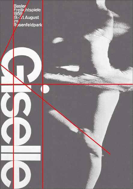
The element with various properties, that are not perceived as a group or of one category are following the same rules within the same grid. That creates the balance between the elements and the invisible vanishing point.

The relationships between the positive elements on the surface are not the only ones the designer considers. The alignment of the negative space with positive elements can also create additional tension. Here the centres of negative and positive circles are pointing to the letter A in the word 'theater The image is forcing the spectator to bounce back and forth, up and down. In the poster below the subheading could have been placed in line with the heading, but that misplacement creates extra contrast between the elements.

The text is embedded in the picture and becomes a shape.

Sources:
Graphic Design Manual: Principles and practice, Armin Hofmann
Armin Hofmann's work:
Poster 1: link
Poster 2: link
Poster 3: link
Poster 4: link


Comments